HK Graph Help

HK Graph provides a rich set of graphing tools for viewing the health and fitness data that is collected by the IOS built-in Health app. Although the Health app does display a graph, there is no way to look at older data or control how the data is presented. HK Graph allows you to choose the types of data to display and plots them on the same graph so that dependencies between the data are easy to see. You can also choose the resolution of the graph from 1 hour to 1 month. This allows trends that occur over long time frames to be identified more easily.
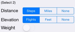
These controls are used to select the type of data to be plotted. Any two can be selected. For example, if both “Miles” and “Flights” are selected, “Weight” can’t be selected until one of the two already selected items are set to “None”
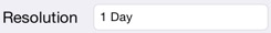
Resolution specifies how much of the collected data is averaged to generate one data point for the graph. For example, a resolution of one hour would be able to display what times of the day were particularly active. A resolution of a week will combine all activity within each week then use then plot the per day average. This larger resolution would be most useful when display data for a long time span such as a year.
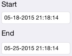
These controls allow choosing the start and end date for the time frame of the data to graph.
This button brings up an extensive list of predefined date ranges such as “Yesterday”, “Last Week”, “Last Month”, etc. This simplifies entry of common date ranges.
Data Selection Screen
Plot Settings
These settings, available for each type of data, allows you to tailor the display of that data.
The weight data type has some additional settings that effect the appearance of the plot
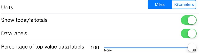
Selects the units the in which the data are plotted
If the selected date range includes today, then this option will cause the partial day’s total to be displayed
If selected, this option will cause each day’s value to be displayed. For resolutions greater than one day, the value will be the average value for each day that was combined. For example, with the resolution of a week, the value will be the average value for each of the 7 days in the week.
Units:
Show today’s totals:
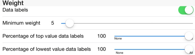
Data labels:
Percentage of top value data labels:
On dense graphs with data labels on, the graph can be difficult to read. This setting allows the data labels to be limited to the higher value items.
In some cases, weight may fluctuate by very small amounts. Since the plot is scaled to the maximum and minimum values, the result may imply large movements. To avoid this, the minimum weight can be set low to effectively scale down these variations.
This is similar to the previous item but operates on the lowest value data labels. With weight data, the lowest valued data may be the most interesting
Minimum weight:
Percentage of top value data labels:
Percentage of lowest value data labels:
This was described previously
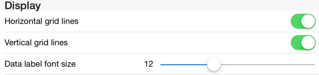
Horizontal grid lines:
Vertical grid lines:
Data label font size:
Turns the display of horizontal grid lines on and off
Turns the display of vertical grid lines on and off
Turns the display of vertical grid lines on and off